![]()
While you may want to use your own software to produce charts (I can convert the SPSS file to Excel for your use), SPSS can produce charts as well. While these are not Powerpoint quality, they get the job done.
Below are four examples of SPSS Chart output. Click on each to enlarge.
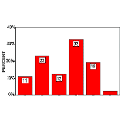
Chart 1 is a simple frequency in bar format.
Chart 2 displays the same information in pie format.
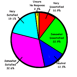
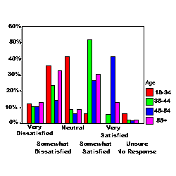
Chart 3 reflects cross-tabulated data (satisfaction level by age group).
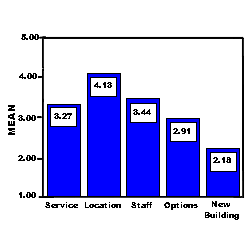
Chart 4 displays differences between means of five related satisfaction variables.
The chart forms (bar, line, pie, etc.) are available in a variety of styles.
|
How Satisfied are you |
How Satisfied are you
|
|
How Satisfied are you with the service you received?
|
How Satisfied are you with:
Click image to see a larger 3-D chart. |
| Sample Reports | Surveys | Education Research | Costs | Email |
Home